In today’s digital world, having a website that works on all devices is key. Responsive web design is vital for a good user experience, no matter the device. Since most users in India browse on mobiles, a responsive site is now a must.
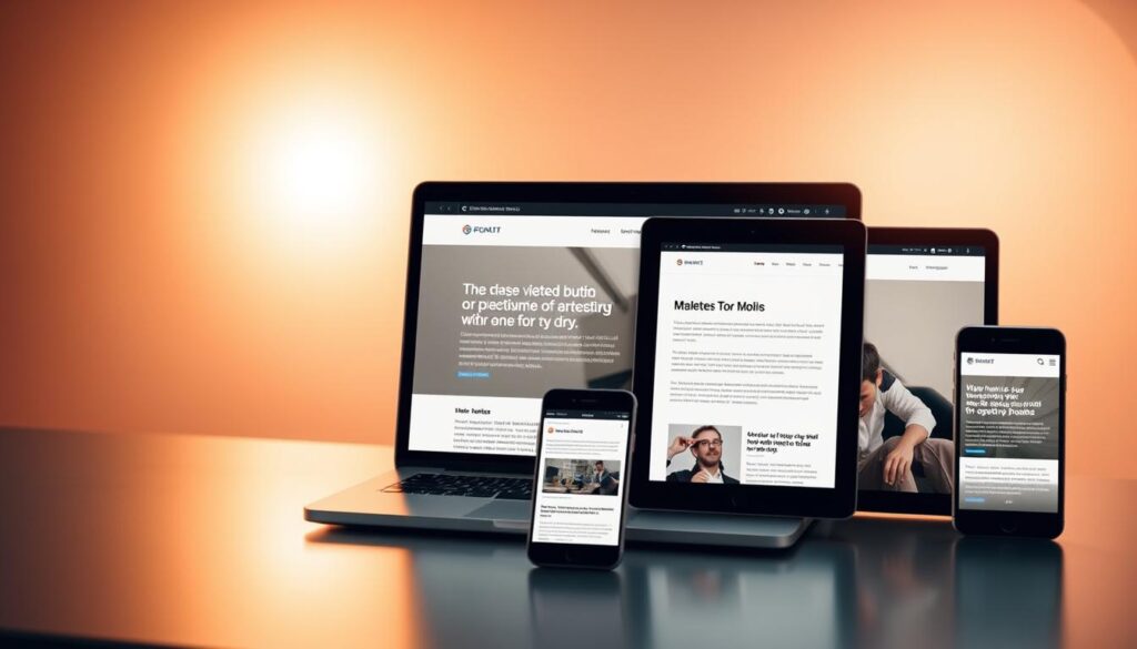
When planning your website, make sure it’s responsive. This ensures your site works well on all devices. It makes your site more engaging and helps users take action.
Key Takeaways
- A responsive website is essential for reaching your target audience in India
- Responsive web design is critical for website development and user experience
- A mobile-optimized website drives user engagement and conversion
- Responsive design adapts to different devices and screen sizes
- Prioritizing responsive web design is crucial for a successful website development strategy
- A responsive website provides an optimal user experience, regardless of the device used
Understanding Responsive Web Design in Today’s Digital Landscape
Have you ever noticed how websites change to fit your screen? This is all thanks to responsive design. It makes sure websites work well on any device. With more people using mobiles, having a responsive site is key for everyone.
Responsive design has a few important parts. Fluid grids let websites change their layout based on screen size. Flexible images also adjust to fit the space they have. These features help make websites that work great on any device.
- Improved user experience
- Increased mobile traffic
- Enhanced search engine optimization (SEO)
By focusing on responsive design, you can offer a better browsing experience. This keeps you ahead in the digital world.
In website development, responsive design is a must, not just a nice-to-have. When updating your site, remember how important it is. It helps make your site user-friendly, which boosts engagement and sales.
The Mobile-First Revolution: Why Your Business Can’t Ignore It
As you explore the digital world, you know how key mobile-first design is in making websites. Most people use mobile devices to access websites. So, making your site mobile-friendly is essential. A mobile-first design makes your site work well on small screens, giving users a smooth experience and boosting sales.
In website development, mobile-first design is not just a trend; it’s a must. It helps you create a site that looks good and works well. This way, you can streamline your website’s layout, making it simple for users to find what they need.
Some benefits of mobile-first design in website development include:
- Improved user experience
- Increased conversion rates
- Enhanced search engine optimization (SEO)
By using mobile-first design in your website strategy, you can lead the competition. And you’ll give your users a better experience.
Key Elements of Responsive Web Design
Creating a responsive website means focusing on several key elements. These elements make your site easy to use on different devices. One key aspect is flexible layouts. They let your website change size based on the screen and device.
Using relative units like percentages is better than fixed units like pixels. This flexibility is crucial for adapting to various screen sizes.
Responsive images are another important element. They can grow or shrink based on the device and screen size. This makes the site look better and loads faster, as smaller images use less bandwidth.
- Fluid grids, which adjust to different screen sizes and devices
- Media queries, which apply different styles based on device characteristics
- Typography, which should be clear and readable on all devices and sizes
By using these elements, you can make a website that works well on any device. This ensures a great user experience, no matter how you access the site.
Technical Foundations for Building Responsive Websites
To build a responsive website, you need a strong technical base. This means knowing HTML, CSS, and JavaScript well. Also, using a content management system (CMS) and e-commerce platforms that support responsive design can make website development easier.
A good technical foundation is key for a responsive website that works well. Here’s how to get there:
- Choose a responsive design framework that fits your needs.
- Use flexible grids and layouts to ensure your website adapts to different screen sizes.
- Optimize your images and media to reduce load times and improve performance.
By focusing on the technical foundations of your website, you can create a solid base for your responsive design. This will help you build a website that looks great and works well. A good user experience is crucial for successful website development.
A responsive website is not just about looking good on different devices, it’s about providing a seamless user experience that drives engagement and conversions.
Mobile Optimization Strategies for Indian Markets
In the vast Indian markets, understanding user behaviors is key. With a huge population and more people using smartphones, there’s a big chance to connect with people through mobiles.
Mobile optimization in India needs a special touch. You must think about local languages and currencies to keep users interested. This way, you can turn more users into customers.
Understanding Local User Behavior
To make good mobile strategies, you must know how Indians use their phones. Look at their browsing, app use, and buying habits. This helps you make ads that really speak to them.
Speed Optimization for Indian Networks
India’s mobile networks can be slow and unreliable. So, making your site fast is very important. Use image compression, code minimization, and caching to speed things up. A fast site keeps users happy and interested.
Regional Content Adaptation
It’s crucial to make content that fits local tastes in India. Use regional languages and cultural references in your content. This makes your site more appealing and boosts sales.
Some important tips for mobile optimization in India include:
- Use local languages and currencies
- Make your site fast for slow networks
- Create content for specific regions
By using these strategies, you can better connect with your audience in Indian markets.
Tools and Technologies for Implementing Responsive Design
Creating a responsive website starts with the right tools and technologies. Frameworks like Bootstrap and Foundation make it easier. They offer pre-made CSS and HTML templates that you can customize.
For testing your website’s responsiveness, tools like Google Webmaster Tools and BrowserStack are key. They help you check how your site looks and works on different devices and browsers. Version control systems like Git also help manage and collaborate on web projects.
There are more technologies to help with responsive design. These include flexible grids, responsive images, and typography. Using these tools, you can make a website that works well on all devices.
- Flexible grids and layouts
- Responsive images and media
- Typography and font sizing
With these tools, you can make a website that offers a great user experience. It will work well on all devices and screen sizes.
Responsive design is not just about making your website look good on different devices, it’s about creating a seamless user experience that drives engagement and conversion.
Investing in the right tools and technologies is crucial. It ensures your website is responsive, user-friendly, and ready for success.
Common Responsive Design Challenges and Solutions
Creating a responsive website comes with its own set of responsive design challenges. You might face issues like cross-browser compatibility, page load times, and content management. Knowing these common problems and their solutions is key.
Some common responsive design challenges include:
- Cross-browser compatibility: Making sure your site looks and works the same on all browsers and devices.
- Page load times: Speeding up your site to keep users engaged and reduce bounce rates.
- Content management: Organizing content so it’s easy to find and enjoy on any device.
To tackle these responsive design challenges, here are some solutions:
- Use flexible grids and layouts to make your site adapt to different screens and devices.
- Optimize images and compress files to speed up your site and improve performance.
- Choose a content management system that makes it easy to update content on various devices and platforms.
By knowing the common responsive design challenges and using effective solutions, you can make a website that’s easy to use and effective. This will help grow your online presence and drive more conversions.
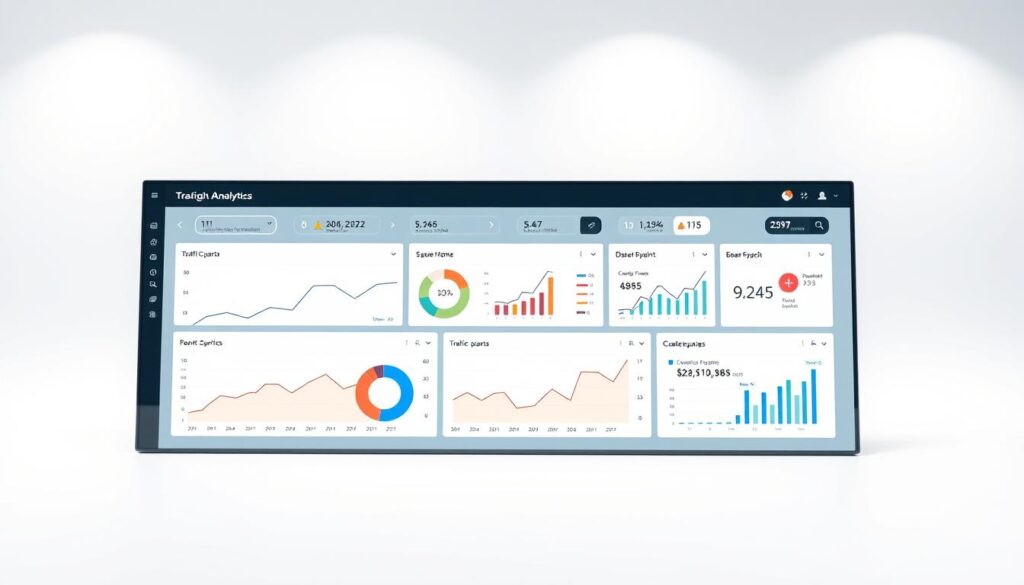
Measuring the Success of Your Responsive Website
To see how well your responsive website works, you need to track important metrics. Use website analytics tools to do this. These tools show how users act on your site and where you can get better.
Look at page views, bounce rates, and conversion rates to learn more. These numbers tell you how users behave. For example, if a page has a high bounce rate, you might need to make it more interesting.
Google Analytics is a great tool for this. It helps you understand your site’s performance better.
Some key metrics to focus on include:
- Page views: The number of times a page is viewed by users.
- Bounce rate: The percentage of users who leave your site without exploring further.
- Conversion rate: The percentage of users who complete a desired action, such as filling out a form or making a purchase.
By watching these metrics and making changes, you can make your website better. This way, you can improve the user experience and get better results. Using data to guide your decisions helps your business grow.
| Metric | Description |
|---|---|
| Page views | The total number of pages viewed by users. |
| Bounce rate | The percentage of users who leave the site without exploring further. |
| Conversion rate | The percentage of users who complete a desired action. |
Future-Proofing Your Website with Responsive Design
Improving your website’s user experience is key. Think about using responsive design to stay ahead. This means adding new technologies to make your site better and more appealing. This way, your website will stay competitive and engaging for your audience in India.
Focus on emerging technologies to future-proof your site. These include artificial intelligence, virtual reality, and voice-activated interfaces. Adding these features can make your site more interactive and immersive for users.
To keep up with new devices and tech, try these strategies:
- Optimize your website for voice-activated interfaces and foldable screens
- Use flexible grids and layouts for a smooth experience on different devices
- Implement responsive images and media to speed up your site
By using these strategies and keeping up with new emerging technologies, your website will be ready for the future. This will improve the user experience and help your site succeed.
Staying informed and adapting to new trends and technologies is crucial. This way, your website will stay modern and engaging for your audience in India.
| Technology | Description |
|---|---|
| Artificial Intelligence | Enhances user experience with personalized recommendations and interactive features |
| Virtual Reality | Provides an immersive experience with 3D environments and interactive simulations |
| Voice-Activated Interfaces | Enables users to interact with your website using voice commands and natural language |
Business Benefits of Implementing Responsive Web Design
Responsive web design is key for your business. It boosts user engagement, ups conversion rates, and drives more sales. A responsive site makes it easy for customers to find what they need.
A responsive website also boosts your brand’s image and customer happiness. It shows your brand is user-friendly and trustworthy. The main business benefits of responsive design are:
- Increased revenue through better conversion rates
- Enhanced brand reputation and customer satisfaction
- Improved user engagement and lower bounce rates
Investing in responsive web design keeps you competitive. With most users on mobile, it’s now essential. Think about how responsive design can help you meet your goals.
Conclusion: Embracing Responsive Design for Digital Success
Responsive web design is crucial for success in today’s mobile world. It helps you create a website that grabs your audience’s attention. This leads to lasting engagement.
Whether you run a business or work in marketing, responsive design is key. It makes your website work well on all devices. This boosts your brand’s visibility and increases sales.
Responsive design is more than a trend; it’s essential for businesses today. Don’t wait to start using it. Unlock your brand’s digital success now.
FAQ
What is responsive web design?
Responsive web design makes websites work well on many devices. This includes desktops and mobile phones. It changes how the site looks and feels to fit the screen size, making it easy to use.
Why is responsive web design essential in today’s digital landscape?
Today, most people use mobile devices to visit websites. A responsive design ensures a good experience on any device. It boosts user engagement and helps your website succeed online.
What are the key elements of responsive web design?
Key elements include fluid grids and flexible layouts. Responsive images and media, and good typography are also important. These help websites adapt to different screens, offering a smooth user experience.
How can I measure the success of my responsive website?
It’s important to track how well your website is doing. Look at page views, bounce rates, and conversion rates. Tools like Google Analytics can give you insights into how users interact with your site.
What are some common responsive design challenges and how can they be addressed?
Challenges include making sure your site works on all browsers and devices. It also includes fast page loads and managing content. Use frameworks, tools, and best practices to solve these problems. Regular checks can help ensure a smooth experience for all users.
How can I future-proof my website with responsive design?
Stay up-to-date with new tech and trends. This includes AI, VR, and new devices. A flexible design approach will help your site stay user-friendly as technology changes.
What are the business benefits of implementing responsive web design?
Responsive design can boost your business. It can increase revenue, improve your reputation, and make customers happier. It leads to more engagement, sales, and loyalty, helping your business thrive online.